How Mid-Century Modernism Shaped the Design of the Doomsday Clock

The atomic bombings of Hiroshima and Nagasaki lead a concerned group of Manhattan Project scientists to form the Bulletin of the Atomic Scientists.

Library of Congress
The atomic bombings of Hiroshima and Nagasaki lead a concerned group of Manhattan Project scientists to form the Bulletin of the Atomic Scientists.
The symbol of the Doomsday Clock as we know it today emerged from the crosscurrents of modernism, industry, and science that ran through mid-century Chicago.

The symbol of the Doomsday Clock as we know it today emerged from the crosscurrents of modernism, industry, and science that ran through mid-century Chicago.

Courtesy of the Bulletin of the Atomic Scientists

Martyl Langsdorf

“So I used my smarts and I invented the Doomsday Clock, which turned out to be with my name attached to it, all these years. It’s a phenomenon in itself.”

Martyl Langsdorf

The Doomsday Clock first appeared on the cover of the June 1947 issue of the Bulletin of the Atomic Scientists, designed by Martyl Langsdorf.

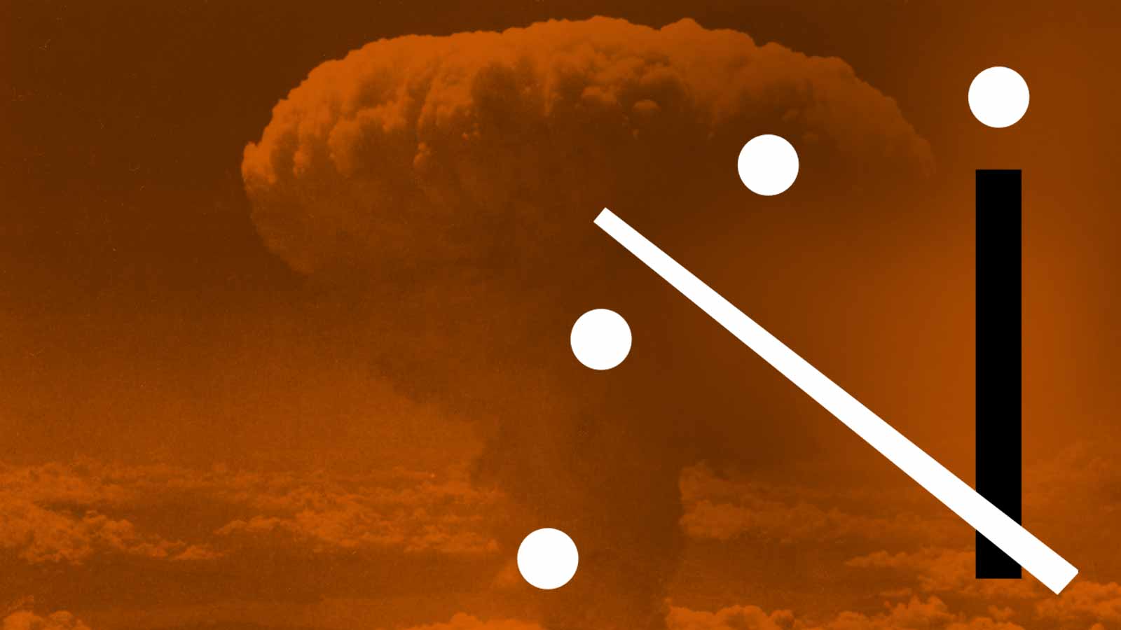
It is two minutes until midnight. On January 24th, 2019, the Bulletin of the Atomic Scientists unveiled this most recent shift of the minute-hand of their Doomsday Clock. The clock maps humanity’s trajectory towards an apocalypse most likely brought on by nuclear warfare or impending and irreversible climate change. Each year, scientists and scholars of the Bulletin’s Science and Security Board convene to decide whether the clock’s hand will be moved forward, towards apocalypse, or back, and away from imminent danger.

Say the phrase “Doomsday Clock” today and a lexicon of images are conjured: a fiery montage of voluminous mushroom clouds á la Dr. Strangelove, coastal cities swamped under rising sea waters, end-of-days preppers stockpiling canned goods in plush underground bunkers, and always, the ever-present minute-hand, counting down the march toward the end. This ticking minute-hand has been taken up and disseminated in a variety of popular cultural forms, from the main motif of the Watchmen comic series, to the titular image of The Smashing Pumpkins’ song, “Doomsday Clock.”

It is a lesser-known fact that the origin story of the Doomsday Clock begins in Chicago in 1947, and is closely linked to the history of mid-century modern graphic design. In the aftermath of the atomic bombing of Hiroshima and Nagasaki by the United States in 1945, a concerned group of Manhattan Project scientists realized their role in creating this potentially world-ending weapon and formed the Bulletin of the Atomic Scientists. Their mission was to warn and educate the public about the dangers of nuclear technology, which they did in part through a monthly publication.

Flickr, Crosset Library

Advertisement by Fernand Léger for the Container Corporation of America, exhibited at the Art Institute of Chicago from April-June 1945.

June 1947 marked the debut of a cover image for the Bulletin of the Atomic Scientists’ newsletter: the Doomsday Clock, rendered in a strikingly modern graphic fashion. Four white dots arched out over two intersecting black and white angled lines, forming an abstracted and geometric approximation of the last quarter of a clock face, superimposed upon a bright orange background, the minute-hand approaching seven minutes to midnight.

The graphic design of the clock, and its proven everlasting visual power, was the brainchild of one woman—the artist Martyl Langsdorf, who went, as celebrities do, by her first name only. Martyl was already a well-known landscape painter when she moved to Chicago in 1943 with her husband Alex Langsdorf, who had been tapped to work on the Manhattan Project, and she would go on to become the originator of one of the most iconic graphic images of the 20th century. Martyl was also the first person to place the minute-hand of the Doomsday Clock. Her decision to set the clock at seven minutes “was pure aesthetics”—she determined the angle and location of the minute-hand based on what looked good, and what was best for the unity of the composition. The story of the Doomsday Clock then, is ultimately a story about design, rooted in the larger history of modernism during the Cold War.

It is no coincidence that Martyl designed the most modern of symbols for the Bulletin’s newsletter. The flat geometric shapes and simplicity of line and color that Martyl employed are hallmarks of the mid-century modern style, popularized during the 1930s and 40s in the United States by an influx of European émigré designers—Bauhauslers such as Laszlo Moholy-Nagy, founder of the “New Bauhaus” in Chicago in 1937. The Doomsday Clock was birthed in a city that was home to not only the Manhattan Project and the Bulletin of the Atomic Scientists, but also Moholy-Nagy’s school, and scion of cardboard boxes and patron of modern advertising art, Walter Paepcke and his Container Corporation of America. In 1945 the Art Institute of Chicago opened the exhibition Modern Art in Advertising: Designs for the Container Corporation of America, which showcased advertisements created for the Container Corporation by modern artists such as Moholy-Nagy, Herbert Bayer, Man-Ray, Fernand Léger, and Willem de Kooning, and set attendance records, attracting 131,000,000 members of the public. The symbol of the Doomsday Clock as we know it today emerged from this milieu, from these crosscurrents of modernism, industry, and science that ran through the city at mid-century.

Courtesy of the Bulletin of the Atomic Scientists

In 2007, designer Michael Bierut made Martyl's clock the centerpiece of the Bulletin of the Atomic Scientist's visual identity. In this most recent iteration of the Bulletin's logo, the clock is set at 2 minutes to midnight.

In Chicago, Martyl’s life was awash in these crosscurrents. The Langsdorfs settled in an apartment that Edward Teller (“father of the atomic bomb”) had recently vacated as he left the windy city for the labs at Los Alamos. Ensconced in the secretive world of the Manhattan Project scientists, but also the vibrant Chicago art scene, Martyl and Alex quickly formed a social circle which Martyl remembered as a “rather closed group of very famous people.” Martyl counted among her confidantes the prominent curator, gallerist and art critic, Katherine Kuh, as well as Waltruat van der Rohe, curator and scholar at the Art Institute of Chicago and daughter of architect Mies van der Rohe. And it was with the help of her friend Egbert Jacobson, art director of the Container Corporation of America, that she finalized the design of the Doomsday Clock.

One evening, while working on the initial design for the Doomsday Clock, Martyl visited Jacobson at his home and solicited his opinion about how to best represent her chosen symbol. After being asked to design the Bulletin’s cover, Martyl had pondered how to represent the urgency of the atomic scientists’ warnings to the world. Sketching out ideas, she eventually landed upon the symbol of a clock. As she wrote later, “the most significant of all was a sketch of a clock, which I made on the 8” x 11” back of a bound copy of Beethoven’s Piano Sonatas. I visualized the cover by drawing a clock in white paint on the black binding of the Sonatas. It was a rather realistic clock but it was the IDEA of using a clock to signify urgency. My idea was to repeat the clock every month on a different color background … the first color being bright orange to catch the eye.”

With the help of Jacobson, she continued to refine her design. “I got his advice … on how to graphically carry out my idea of superimposing a clock, a table of contents and other pertinent information on the cover with style and clarity” she remembers. Jacobson’s experience in designing and directing the modernist graphic identity and advertisements at the Container Corporation of America influenced the image that he helped Martyl design, resulting in a final cover for June 1947 issue of the Bulletin, and the everlasting symbol of the Doomsday Clock.

Wikimedia Commons

The graphic gesture of the Doomsday Clock's ticking hand is mirrored in a cover design for the Watchmen comic series.

Though Martyl received advice from Jacobson, the design of the clock was unequivocally hers. (This fact was not always common knowledge, even among Bulletin members—Eugene Rabinowitch, founder of the Bulletin once confessed to Martyl that he “thought the idea of the clock so brilliant that it surely must have come from Edward Teller.”) As she wrote, “So I used my smarts and I invented the Doomsday Clock, which turned out to be with my name attached to it, all these years. It’s a phenomenon in itself. The clock has a life of its own now. It’s amazing.”

Since its initial debut in 1947, the hands on the Doomsday Clock have shifted forward and back twenty-five times. Even as the trope of the clock becomes more widely recognized and publicized, the modernist elements in the design of Martyl’s clock remain central. Today the Doomsday Clock has been reimagined as the official logo of the Bulletin of the Atomic Scientists. Graphic designer Michael Bierut, who redesigned the Bulletin’s visual identity in 2007, recognized the power of the clock’s original design and made its four dots and two lines the centerpiece of the Bulletin’s updated identity. For Bierut, the clock is an “intuitively tension-building image,” and he marveled at Martyl’s ability to “reduce something that complex to something so simple and memorable,” calling it, “a feat of magic.” In a world that still teeters on the edge in the face of nuclear destruction and irreversible climate change, Martyl’s clock continues to tick onward as a potent and powerful icon of the apocalypse, but also one of cold war mid-century modernism.

About the Author

Charlotte Hecht

Charlotte Hecht is a PhD student in American Studies at Yale University where she studies visual culture, particularly the history of design and the built environment, and the relationship between aesthetics and politics.

Subscribe to our free e-letter!

Webform

Latest News

A Rediscovered Klimt Painting Goes to Auction In Vienna

A portrait, originally thought to be lost, painted by Austrian…

An Introduction to Art Therapy: Its History and Practice

Art has been used as an outlet for the 

10 Must-See National Pavilions in the 2024 Venice Biennale

The 60th edition of the International Art Exhibition, titled…